
Spotted #9
Adrian Dinsdale
It's time for our weekly round-up of the branding, logo, typography and graphic design shots that have caught our eyes on the streets of London this week.
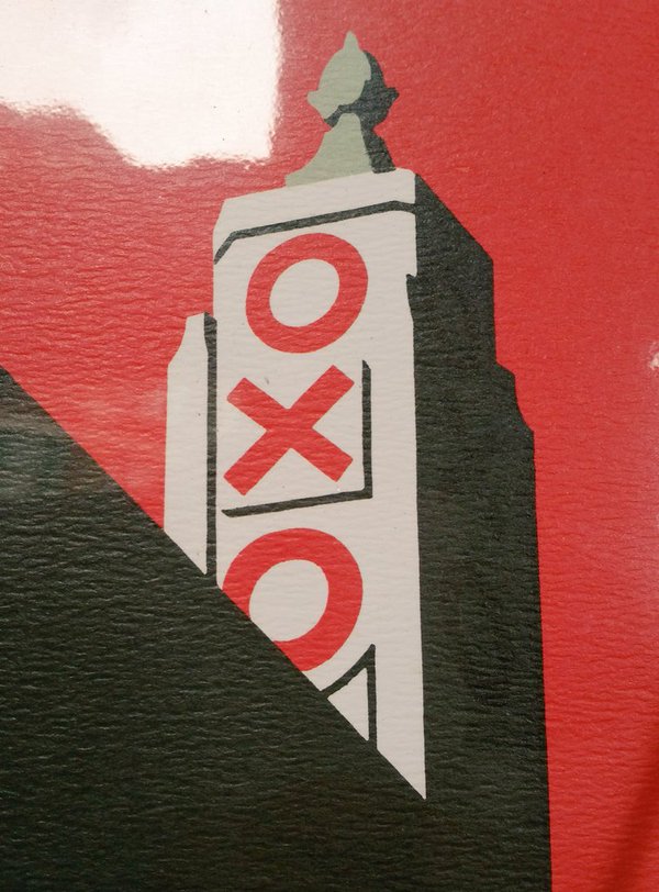
Our story this week focuses on a riverside landmark, whose story many Londoners do not know.
In 1929, Liebig Meat Company, manufacturer of the famous Oxo beef stock cubes, decided to convert an old power station on the banks of the Thames into a cold store.
The design called for a tower to be added to the building, upon which illuminated signs would proudly display the Oxo brand. When this idea was put in front of the planning authorities it was rejected, as skyline advertising along the river bank was banned at the time.
Construction work continued on the tower and, upon completion, it was revealed to contain fours sets of three vertically-aligned windows, each of which "coincidentally" happened to be in the shape of a circle, a cross and another circle, thereby spelling the word Oxo. Ingenious.
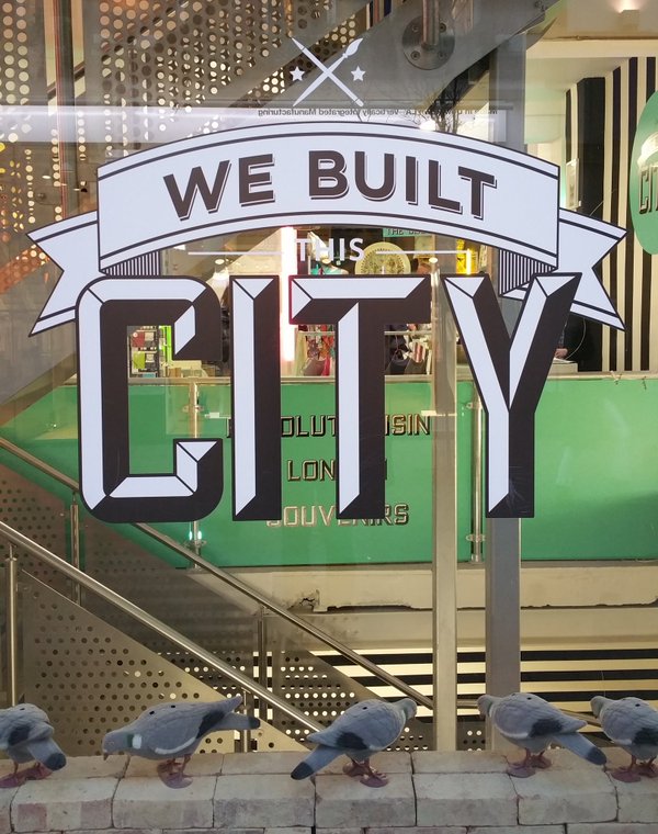
Identity for London's coolest souvenir shop, We Built This City
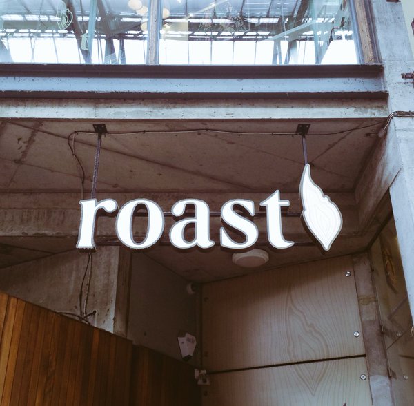
Logo for Borough Market restaurant Roast
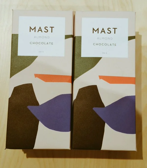
Branding and packaging for Mast Brothers chocolate
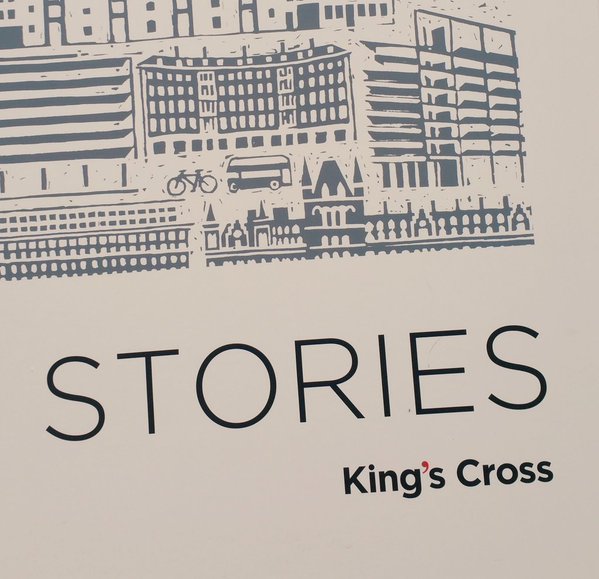
Identity for King's Cross Central, the property developer transforming London's King's Cross