Spotted #12
Adrian Dinsdale
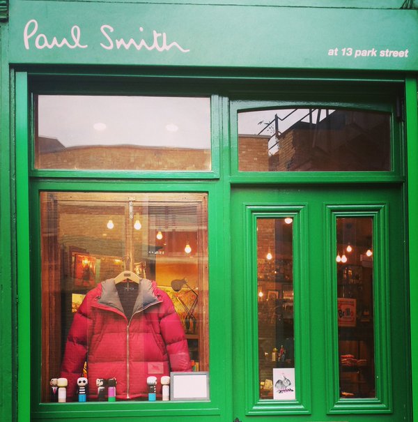
It's time for this week's round-up of our shots of typography, branding and logos spotted around our home city of London. The story behind our shot of Paul Smith's shop in Borough takes us back to the 1960s, when Smith was a budding professional racing cyclist. He had his career all mapped out and then he unexpectedly crashed into a car one day. It was during his time recovering that he fell in with the art school crowd in his home town and soon developed a passion for fashion that would see him showing his clothes in Paris only a few years later. Paul Smith's brand is now one of the most successful British fashion labels and his quintessentially British designs have fans all over the world. But his love of cycling lives on.
What else we've spotted this week....