Xspray Brand
Xspray brand. Logo. Brand. Design. Visual identity. Branding. Graphic design.
Phosworks: Xspray

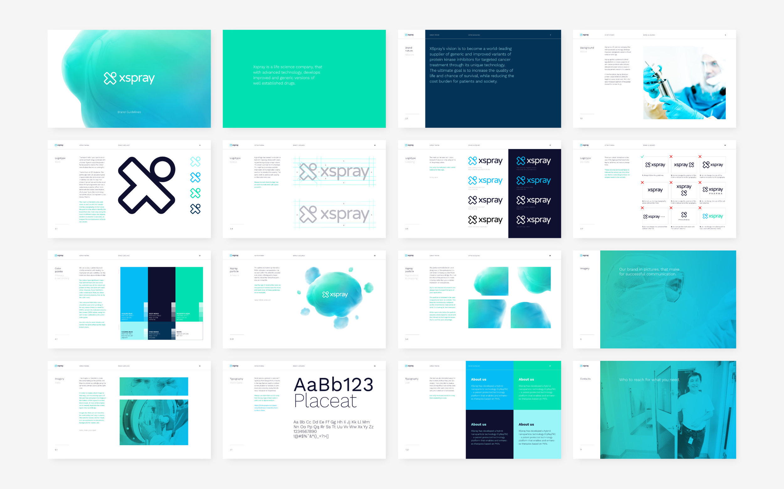
Xspray Pharma is a credible, high-tech, innovative company in the pharmaceutical industry, that through a unique revolutionary technology improves life-saving treatments. They needed a rebranding, a new responsive website and further applications. The main goals of Xspray are to attract investors and potential partners for future collaborations and later establish Xspray’s unique technology in the industry. The strategy revolved around the fact that Xspray differentiates from the rest of the competition by having serious humanitarian values and a passion to improve the way the anti-cancer industry functions towards the lives of patients. We created a strong mark that can work alone and last through time. The letter “X”, formed by a tilted human figure, has a positive incline towards the upper right, and holds values of credibility, seriousness, positivity, human-centricity, passion, friendliness and innovation. The mark, combined with a rounded geometric sans serif used only for the logo, communicates the values and the core of the brand instantly. A second geometric sans serif was used as the main brand typography, for all the written communication, both in print and digital. The colour palette comes to complete the identity, consisting of colours that carry harmony, healing, calmness, credibility, knowledge and innovation. We then created a visual language, based on the organic shapes of powder nanoparticles, that Xspray are working with. Painted in the brand’s colours, the nanoparticle works in numerous formats along all the applications, keeping consistency and recognisability even if it stands alone or seen at a glance. The main reason for the visual language was to create a distinguished look from the rest of the competition and leave a memorable mark, after viewing, to every potential user of the target group. This is, because an investment or a partnership, will usually take thorough thinking, reflection upon and comparison among all possible candidates. So we had to make sure that Xspray has the advantage at that stage. The keywords we used for the strategy and the tone of voice are: Innovative, human-centered, credible, high-tech and refreshing.